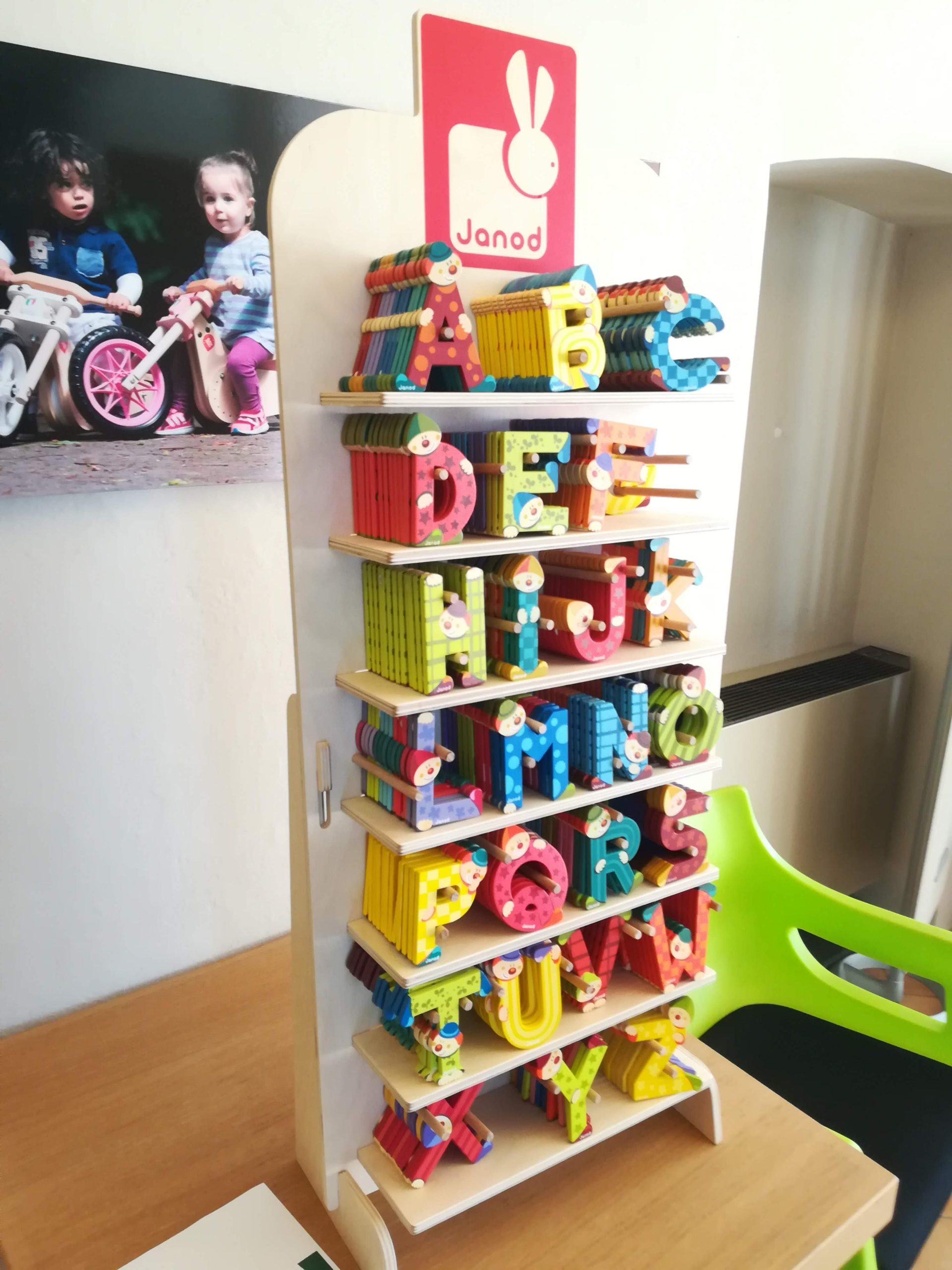
A display with a unique scheme to make the product stand out
Sometimes a phone call is enough to give life to an original and unique project, to one of those challenges that put into motion all our design skills (and creativity), but that when we solve them fill us with pride.
As it happened with Janod, a brand of Juratoys, a customer we have already talked about on these screens (here). Janod makes games that promote natural learning from an early age. The products are made of wood and cardboard with great attention to design.
In short, we are kindred spirits and maybe that’s why when the need arose to create a new display for a very special product, from Janod they picked up the phone and contacted us.
And it went more or less like this:
One product, many shapes
*phone ringing*
Janod: We need a counter display for our wooden alphabet letters. We have to display all the single letters on one panel without creating containers that limit their visibility. We want them to be the absolute protagonists and for this we think of a support that is as unobtrusive as possible.
Us: Perfect, so how are the letters packaged, can we hang them? Is there a box that we have to place on a shelf?
Janod: I would say no, since we don’t have a pack. Our letters are distributed without envelopes or boxes. We have to display the letters neatly all in a vertical position, maybe creating a tailor-made support for each letter…
Us: So a different scheme of display for each letter on a single counter display? A very important challenge…
Janod: Of course, that’s why we rely on you!
Redefining the abc of display
To sum up, we have products with irregular shapes and each one different from the other, with different sizes that have to stand vertically with a support that fits between the peculiar shapes of the single reference. All this on a board, without the help of regular containers.
Obviously for each letter displayed there must be several pieces available, at least six for each reference, and certainly the overall balance must not be too precarious, because you know that in retail shops the accidental bump is always possible and picking up a cascade of letters at every slightly rough passage is not an attractive prospect.
How to solve this puzzle?
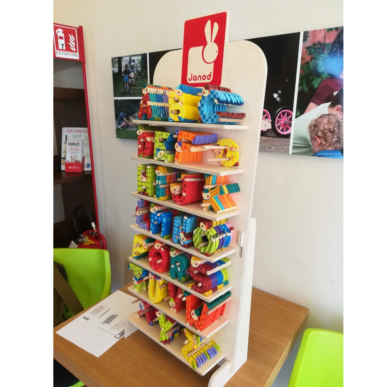
The display that is not there…and you can see that
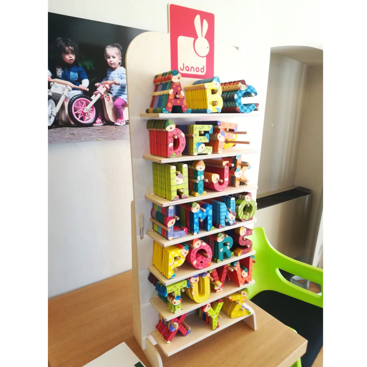
We came up with a layout of wooden rods designed as specific supports for each different letter, which on the display board looks like a small forest.
Finding the right arrangement was not immediate, but after seven trial versions we arrived at the ideal composition…and the result is definitely worth it: the product really stands out.
The letters are presented in a light way, with a cheerful rainbow of colors that stand out on the naturally light tone of the display, which is reduced to the bare minimum, with only the Janod logo that stands out in red in the upper part.
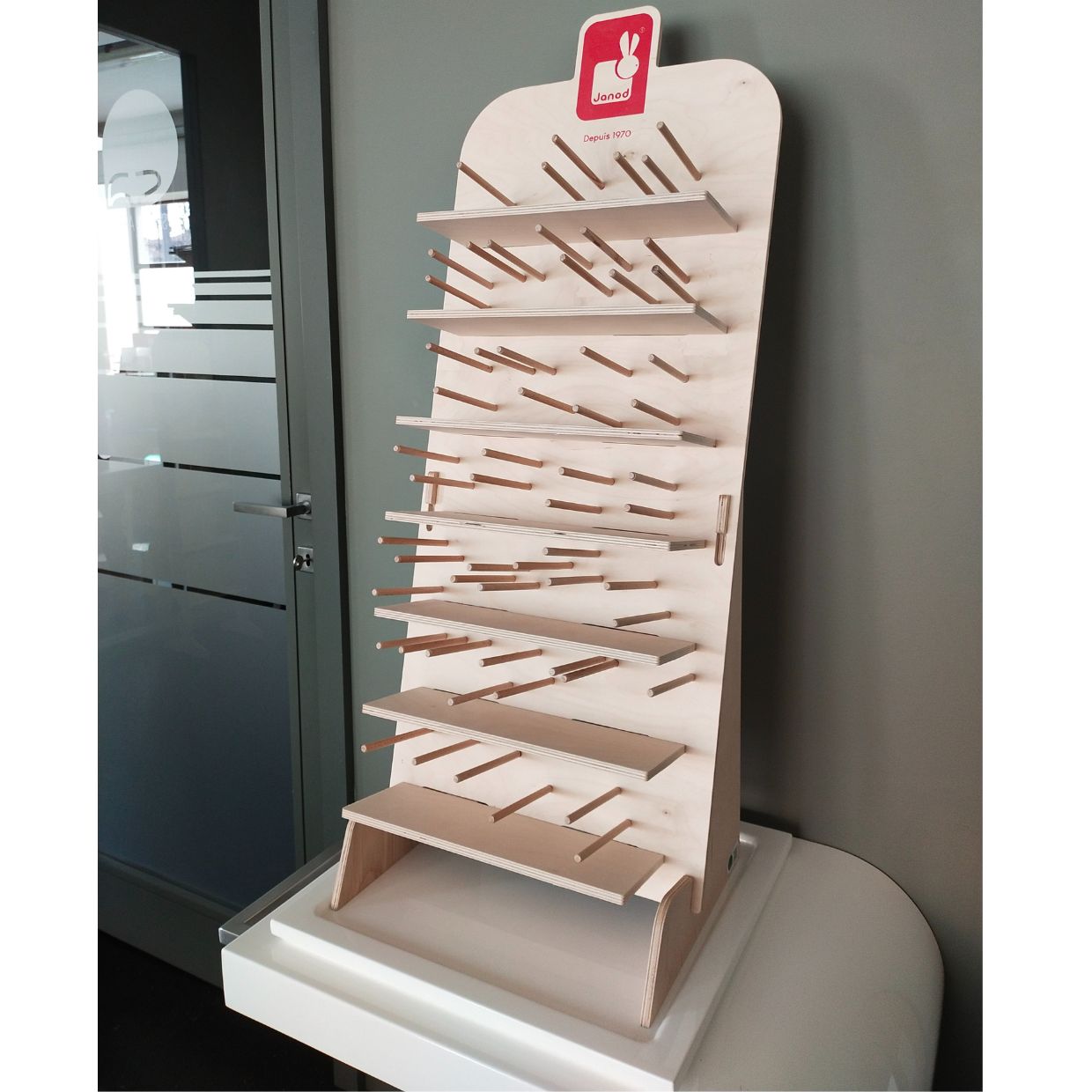
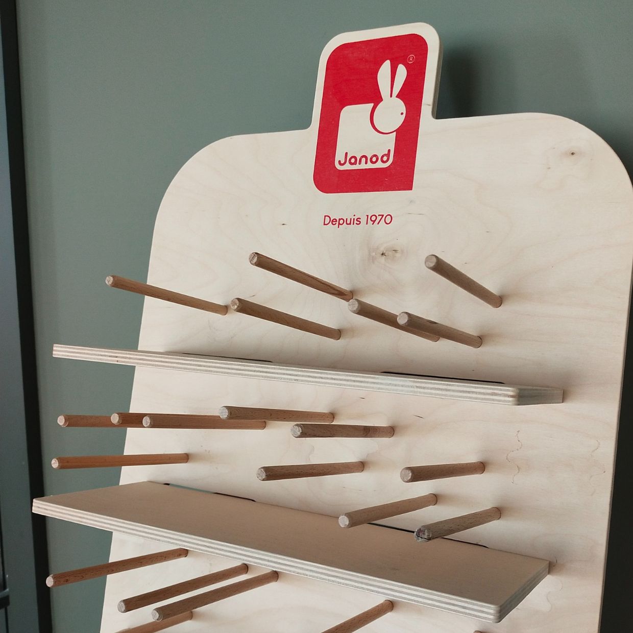
This unique project is an example of a display which is built around the product and it shows how displaying can be done effectively but discreetly.
Being there without being seen, in an easy, light and sustainable way.
If you also have a mission impossibile in displaying products, we are ready to talk about it. Let’s design together!
